Friday, December 23, 2016

Final Tattoo


I believe the strongest area of the piece of work I created was drawing it. I felt like I drew the sloth and Bermuda long-tail to the best of my ability (even though I am not that well at drawing). to my surprise it came out actually looking like the animals and i was proud of myself. The area of the piece that I could have improved on would have been blurring it better into the skin. I had a very hard time making the very dark lines blend into the skin. I found it hard to fit my skin color and make it look believable.
I thought the easiest part of the piece was stretching it to look like its on the skin. It was easy and I feel that i made it look as if it was wrapping around the leg as it would if it was real. It is in fact something I would someday love to get in the future and realized i would like to NOT get it on my leg! I thought the most difficult part was again, blending it. My teacher said to highlight the light parts of my skin and darken the darker parts of my leg. It was hard to find the middle and it was hard to make it match my skin but also not be too light. To ALMOST make this possible i used the Burn tool, to darken it, warp tool, to stretch it around my leg, multiply to cancel the white, and the lighting tool to make it lighter.
 I demonstrated the goal by putting a Bermuda long-tail and a sloth on my thigh, where i thought i would want it for real. Now that how i have tried it out and looked at what it might look at  i do not really like it, so thank you for making me realize that! If i had to do this project again i would definitely put something totally different somewhere else to see if i also maybe do not like it, or even love it more!

Wednesday, December 7, 2016

Album Cover Project


I believe the strongest area of the piece of work I made was picking out the different pictures and blending them together. I tried not to make any harsh edges and make them look all mashed together but not make it seem messy and thrown together. I believe an area my work could be improved on would be matching the pictures and filters. Each one of them have different filters and although it looks good, maybe if I did some of the filters the same it would be striking more so to the human eye.

One thing that was easy about this project was taking out the background of the pictures and making the center of the pictures pop. i thought that was easy because i had to do it with each one so i got a lot of practice and got better with each one, getting all of the background. One thing I found Difficult was picking out the pictures. when I was trying tho think of things i liked and loved nothing came to mind. but as time went on i kept remembering the little things i love, like sloths! some materials i used was the shaping the background out and the filters. those were the most common ones i used throughout the album cover project.

I demonstrated the objective by pulling all the things i loved into one image and making an album cover out of it! i feel that i did a pretty good job getting the objective and will continue to in my next projects! If i could do this project again i think maybe i would put a few more pictures in and switch some out. i would also do a better job at doing a different color pattern and make it more colorful!

Friday, November 4, 2016

baby sloth

 
                                                                        SLOTH!!!

Friday, October 21, 2016


I believe my strongest area of work in this project would have to be shading them in. I think its so easy to make the shape of the body and edit out the background to make it look like there are multiple me's! Although I THINK I am pretty good at this I could improve on some things, like making them look more realistic. When i look at the picture, to the left, it kinda looks like I am floating or not touching the ground.
One thing I thought was easy about this project was getting all the characters to line up. Ms. Cabral showed me how to fade one of the pictures to help line it up with the others and I found that super helpful! One of the challenges or difficulty i had with this project was making the background line up. all those little lines were on other lines, overlapping and it was very difficult to make them all in line. Yet I managed to make it work, with the help of the pain tool. that is what i used most out of everything to make things appear and disappear. I used them VERY often.

I demonstrated the goal in this project by adding a bunch of me's! And i did! I added an extra me in the picture just to fill it all up and i did a bunch of new poses to make it interesting and appealing to the eye to look at. If i had to do this project again I think i would pick a new location with a simpler background and maybe not as sunny place and wear different outfits. Other than that I wouldn't change a thing! I am very proud of what I have created and cant wait to do more :)


Friday, September 30, 2016


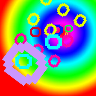
         I believe my strongest area of work is yet to be found. In Photoshop, there are many areas to be worked on. I am new at this so I am still figuring out what my strong suit is! something that can be improved on would be the putting letters in. I found it hard to size the letters, choosing a font and having to go back to click a new button for every action. Its one of the hardest things I have done on a computer.

          I thought the easiest thing about this art activity would be the background. it was very simple to locate and also there were many choices to pick from and a good way to use color theory. Plus you could move the background, so I thought that was interesting! One thing I thought was difficult was having to click different buttons for every actions, it really confused me having to click on button to move something and having to click another to size it. Some materials I used were the 3D, which I am not sure worked but I tried it, I used different colors for each O using composition and I sized them all different to look like its coming out of this bright galaxy hole.
            
          I demonstrated the objective by putting multiple O"s  by using letterform in the center to the left corner to make it seem like its coming out of the hole. I envisioned more than just a bunch of O's on the screen, I wanted the picture to make someone think and have a good imagination. If I could do it again, I wouldn't change a thing. I am pretty proud of my work, considering this is the first time I have done something to this extreme. So no, my work would end up the same!